Redesigning a Juice Brand
LET’S DRINK JUICE

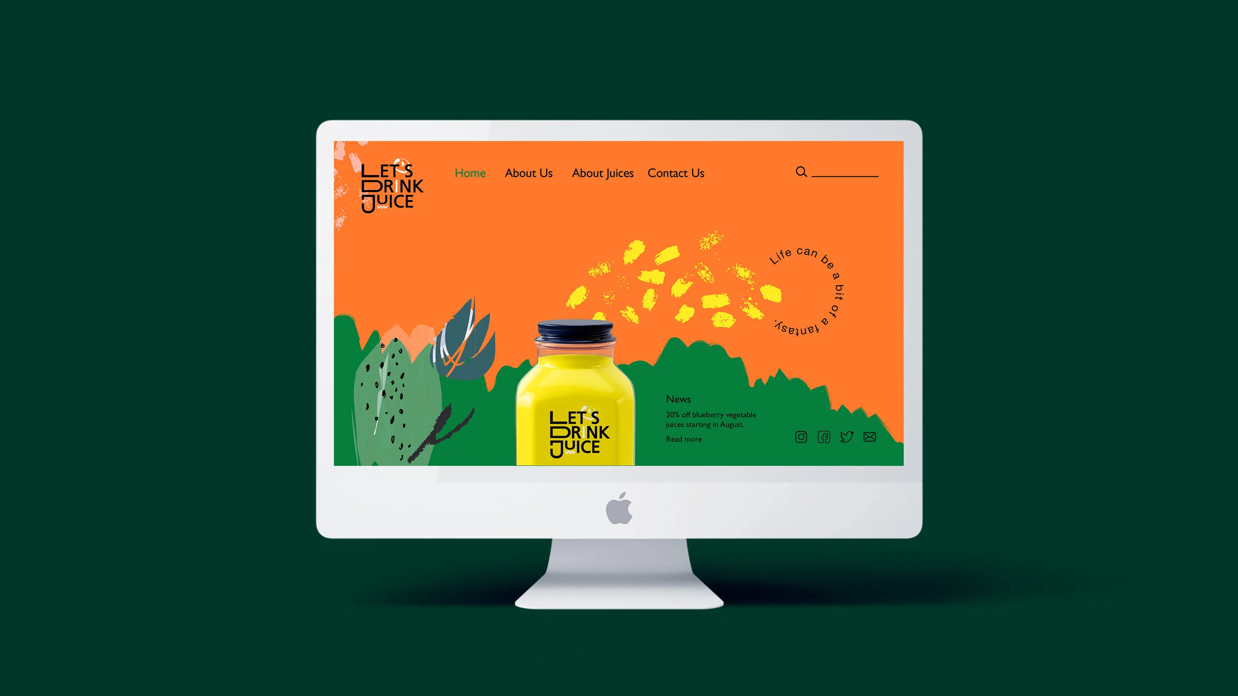
In this project, the focus is on redesigning the brand system for a juice vendor in Taiwan. The motivation behind this initiative stems from the observation that numerous juice vendors in Taiwan lack a coherent brand identity, often resorting to handwritten signs for product listings. Recognizing the health benefits associated with consuming fresh juice, the aim is to promote the adoption of this habit among a broader audience.
The primary objective of this redesign is to establish a cohesive and visually appealing brand system that resonates with consumers. Leveraging illustrations and saturated colors, the goal is to infuse vibrancy and vitality into the brand's visual identity. By replacing handwritten signage with a professionally designed logo and product labeling system, the intention is to elevate the brand's perceived value and credibility.
In addition to enhancing the aesthetic appeal, the incorporation of the slogan "Life can be a bit of a fantasy" serves to evoke a sense of excitement and allure associated with consuming the brand's juices. This messaging conveys the idea that each sip of juice is akin to embarking on a journey of discovery and delight.
Ultimately, through this redesign, the aspiration is to not only elevate the visual identity of the juice vendor but also to inspire a greater appreciation for the health benefits of consuming fresh juice. By creating a compelling brand experience, the aim is to attract and engage consumers, fostering long-term brand loyalty and advocacy.